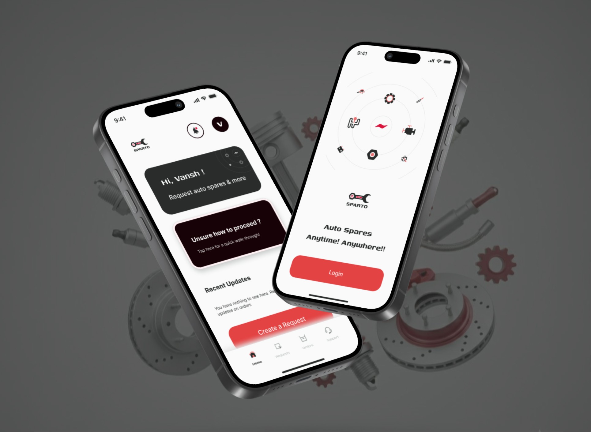
Sparto: Auto Spare parts for Vehicles
2025
Industry
E-commerce
B2B
B2C
When the founders of Sparto came to me, I was immediately hooked by the challenge. They weren't building a standard e-commerce app; they were creating a platform with a trickier approach: creating a request based solution to order. This meant I couldn't just design a typical ecommerce "add to cart" flow. I had to do something different.
My Role
Tools Used


Metrics Achieved
Time on Task
Usability Tests
Challenge
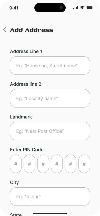
The core challenge with Sparto was to design an e-commerce experience that wasn’t based on a typical models you see with platforms like Amazon, Blinkit or Swiggy. Since the platform specialized in finding rare or specific automobile parts, the entire user flow had to be built around a request-and-quote system, which required a fundamentally different approach to navigation, user input, and communication.
Constraints
The initial stakeholder vision was influenced by competitor apps that had cluttered UIs. A key constraint was the need to advocate for and educate the client on the importance of whitespace and modern design principles for a better user experience.
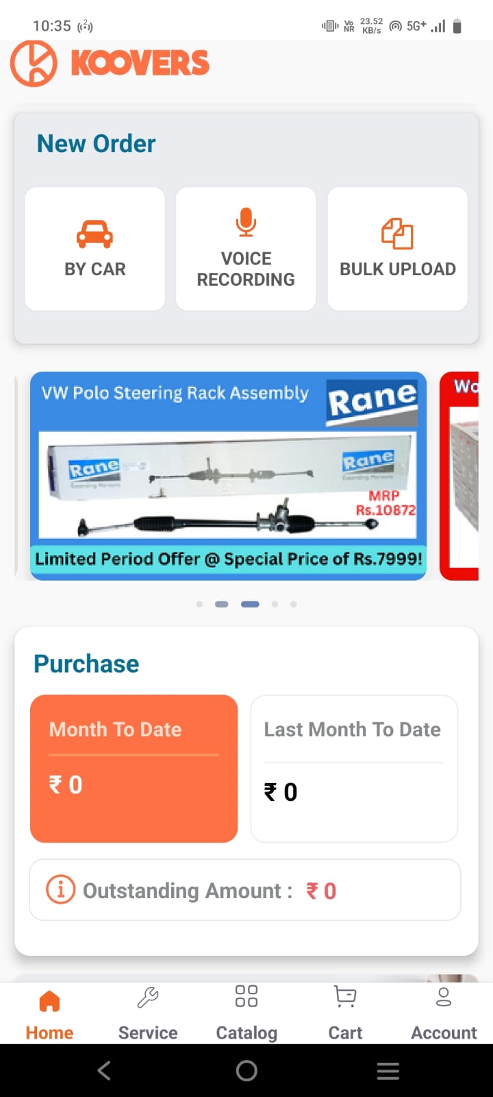
Koovers
Sparto
As the only designer on this project, I was the single point of contact for everything from high-level strategy to pixel-level detail. I worked in a lean setup, collaborating directly with the founders and a separate development firm. It also meant I had to be the bridge to development, using my own front-end knowledge to explain how design concepts could be implemented in Flutter.
Research
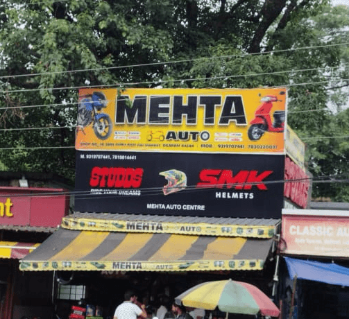
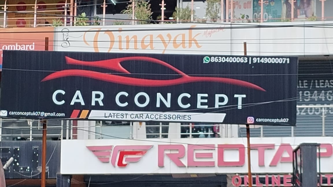
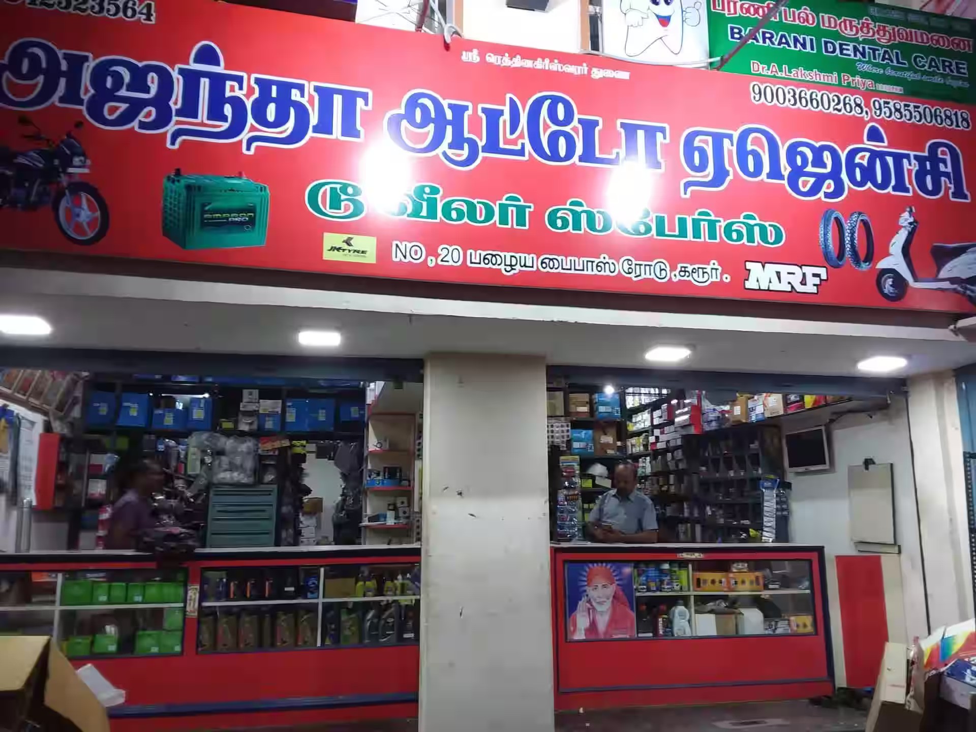
Before designing, I dove into the world of auto parts. I conducted informal interviews with local parts dealers and car hobbyists to understand their vocabulary, workflow, and pain points. I understood which apps they use for shopping or ordering items which gave me strong indication to their preferred style of navigation. A key insight from this research was the significance of the color red when it comes to auto parts in Indian markets, which directly informed the app's primary color palette. 🎨
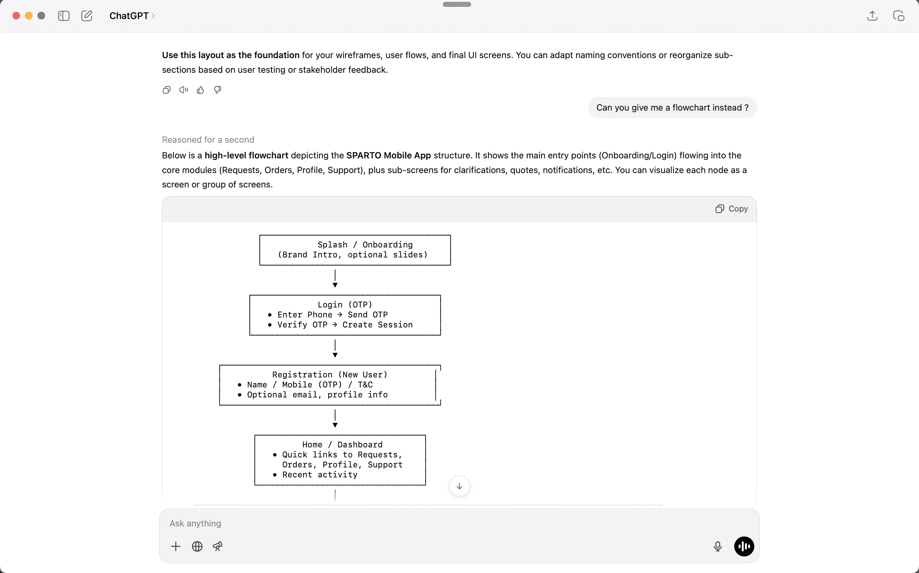
Leveraging Gen AI tools
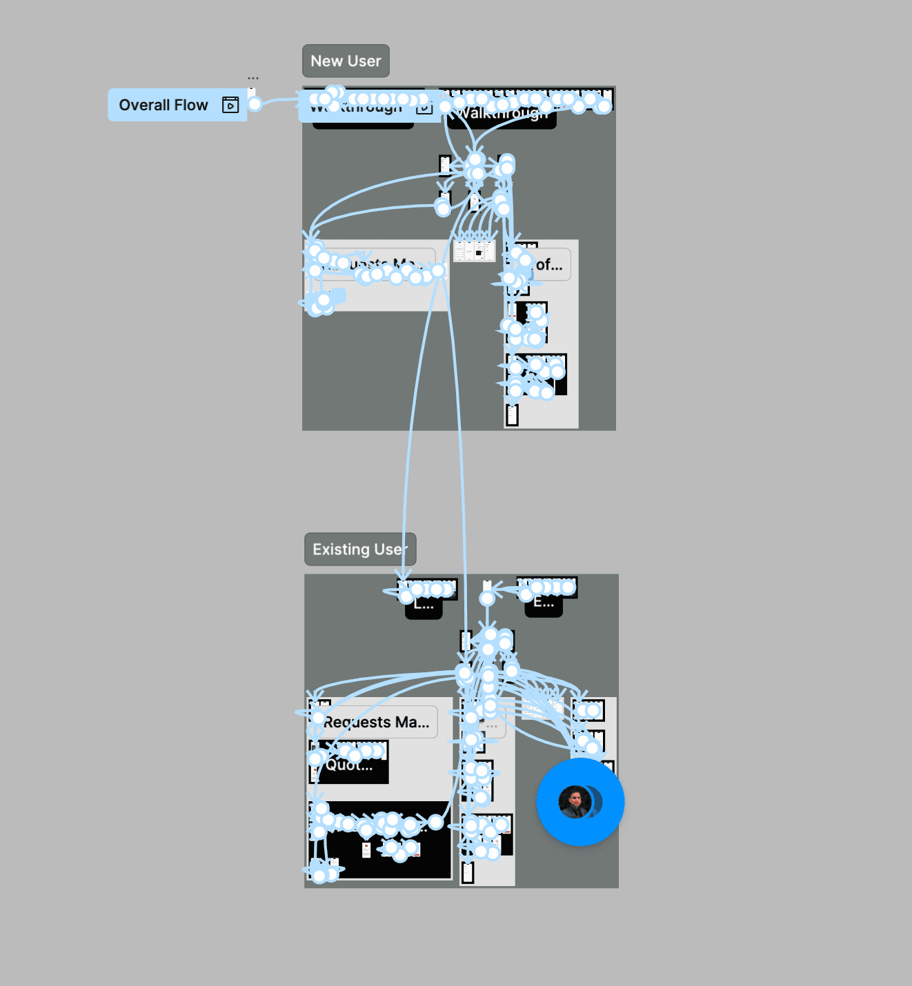
I started with creating the logo and brand identity for Sparto which gave me a visual direction to go for. After that, I brainstormed with ChatGPT to define an information architecture of the mobile app.
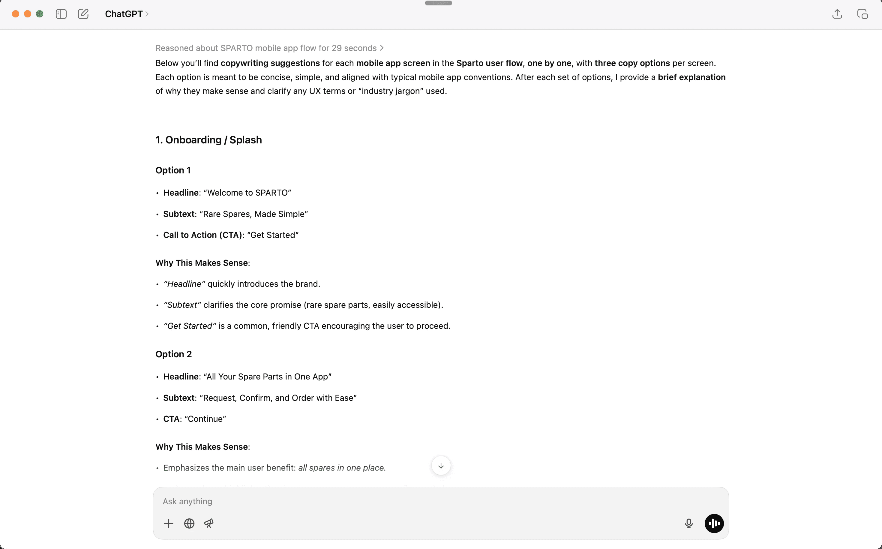
After having a properly defined information architecture, I generated different options for the copy to speed up my process further. Here is the prompt I used:
" You are a UI copy writing expert with 20 years of experience.
Please help me generate the copywriting of the UI in the information architecture above one by one with their Section names, headlines, Button CTA(add relevant copies if I am missing something.)
Give me 3 options, written in simple, descriptive way, similar to most other software tools, and explain in a short and precise way why they make sense. If you use industry jargon or UX principles, explain them as well.
For context: Refer to the flowchart and the information architecture we've built above for more details.
The purpose of the design is to create a simple mobile app for the target audience to request, confirm and order the spare parts they need. Send me the copywriting one by one of the individual UI screens according to the IA you have prepared. "
Which gave me the options of copy I needed to select to get started.
Getting down to work
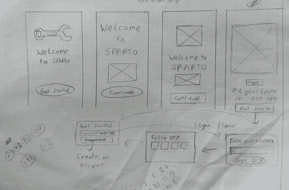
After all the background work, I ideated the app concepts with paper prototypes. (This looks like a mess, I know)


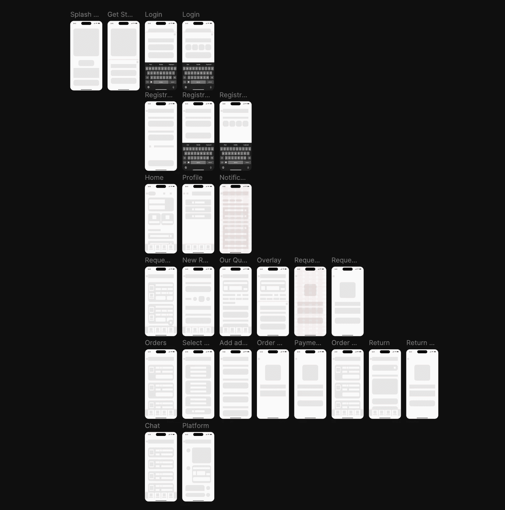
After I finalised my vision on paper, it was time to go digital. I created the Lo-fi Wireframes and discussed with the developer on how to use them as loading states.
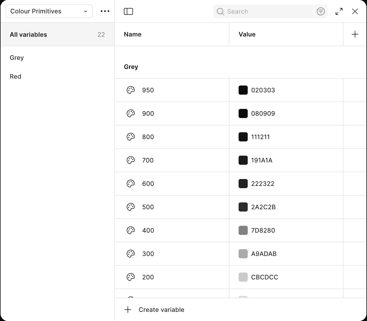
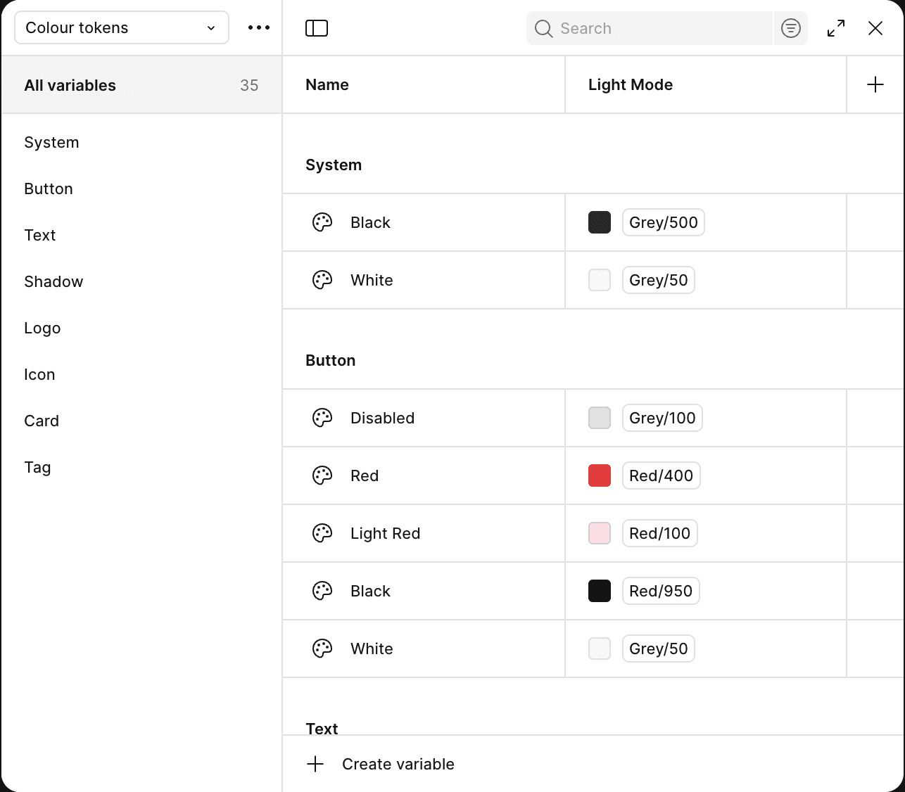
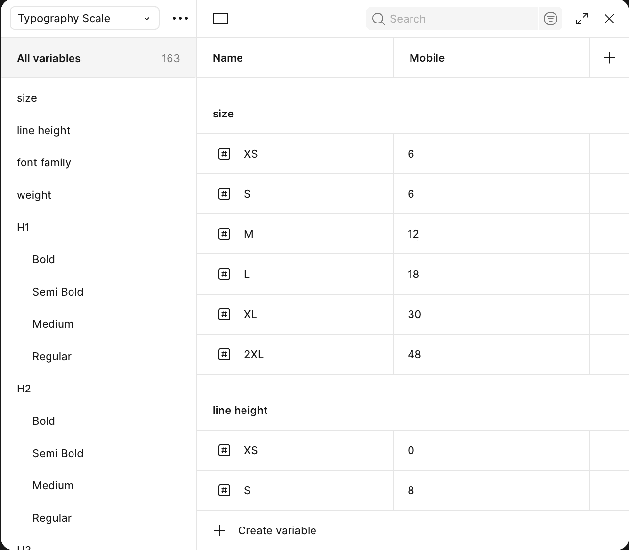
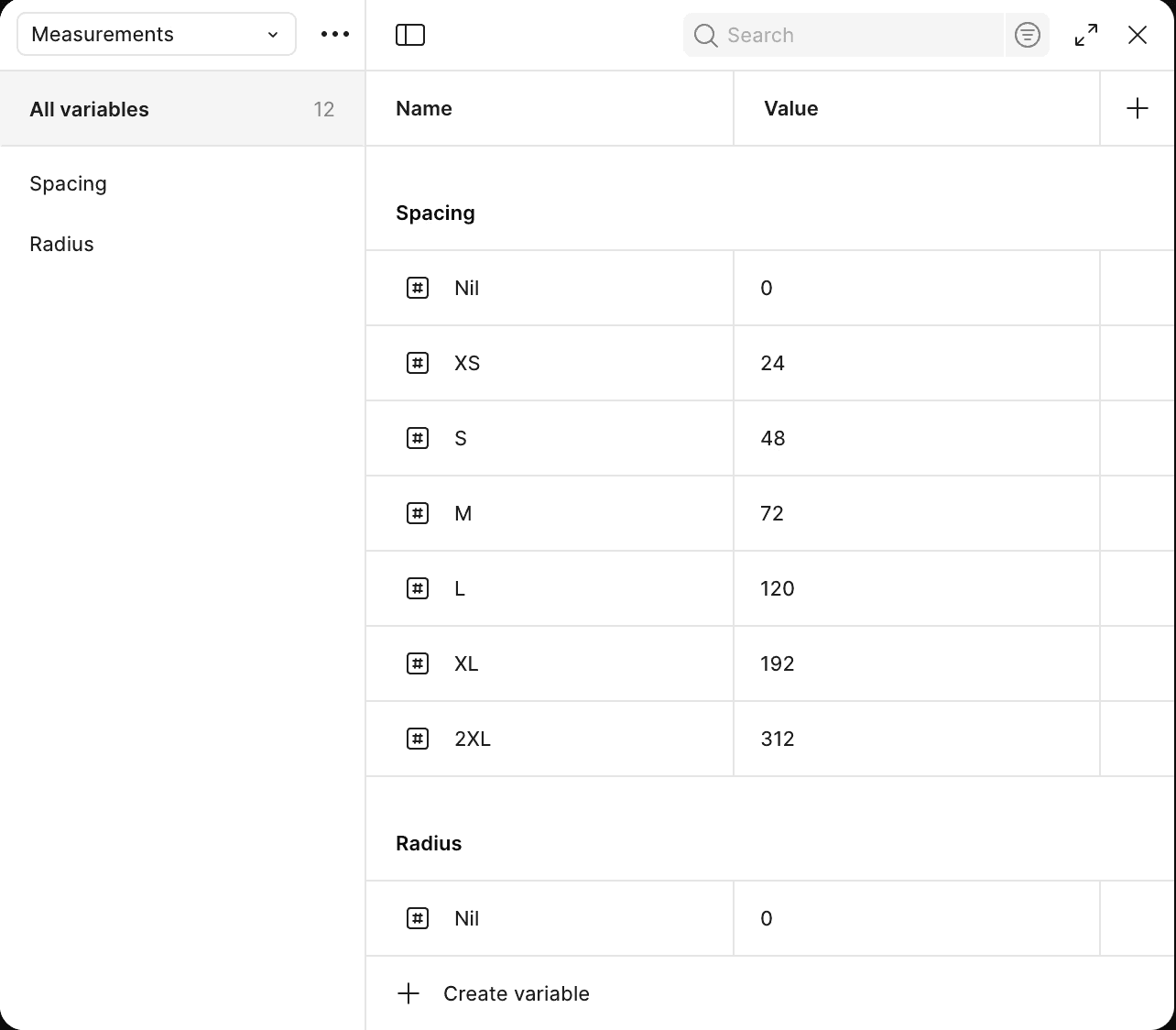
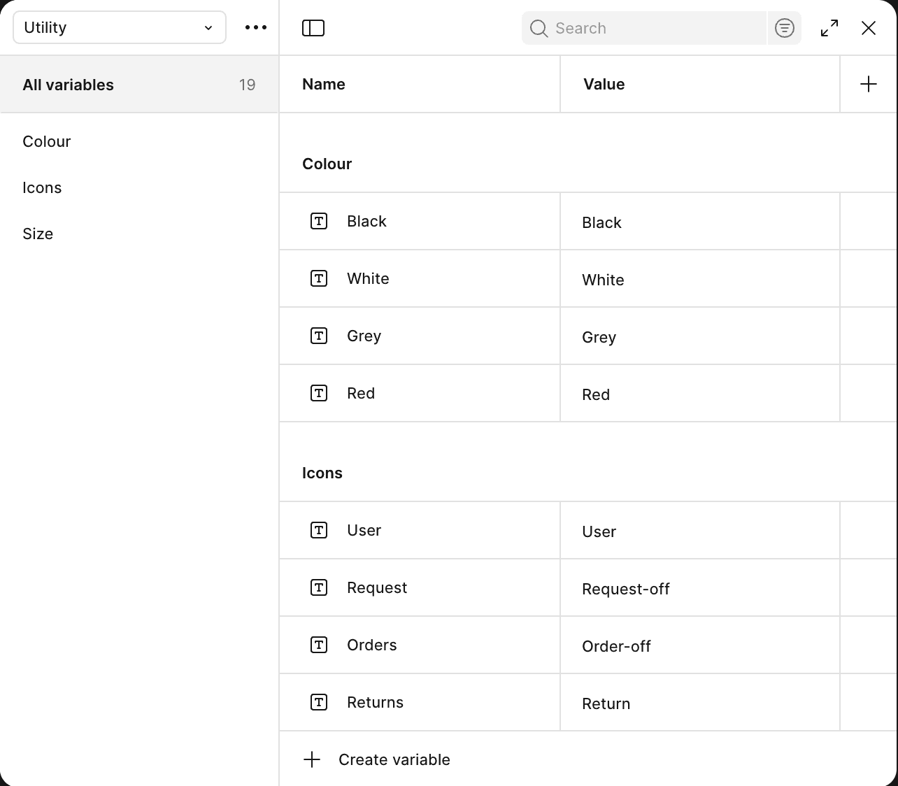
After that I created an extensive design system which followed the atomic design system. I created the variables and component tokens all set in place.

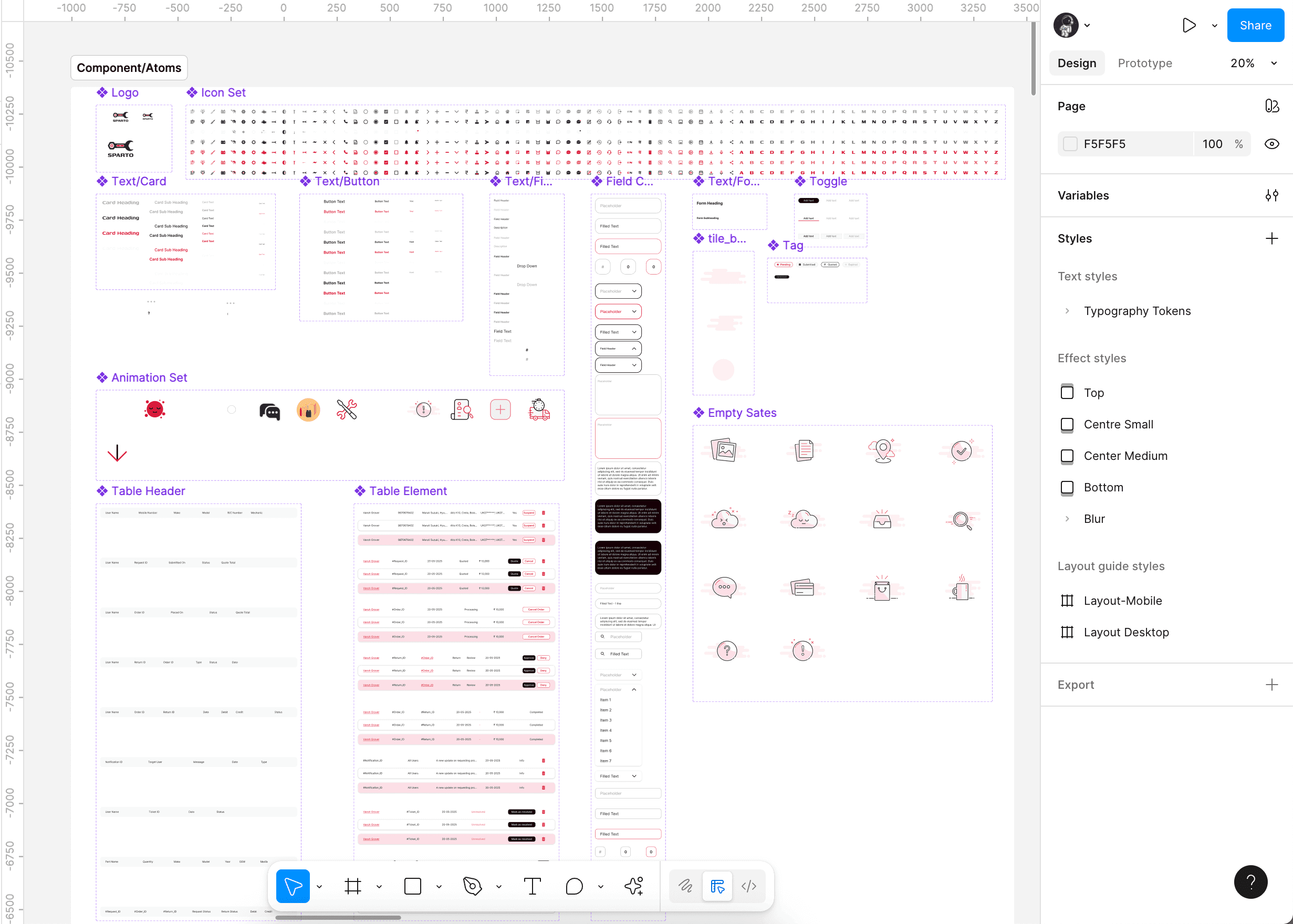
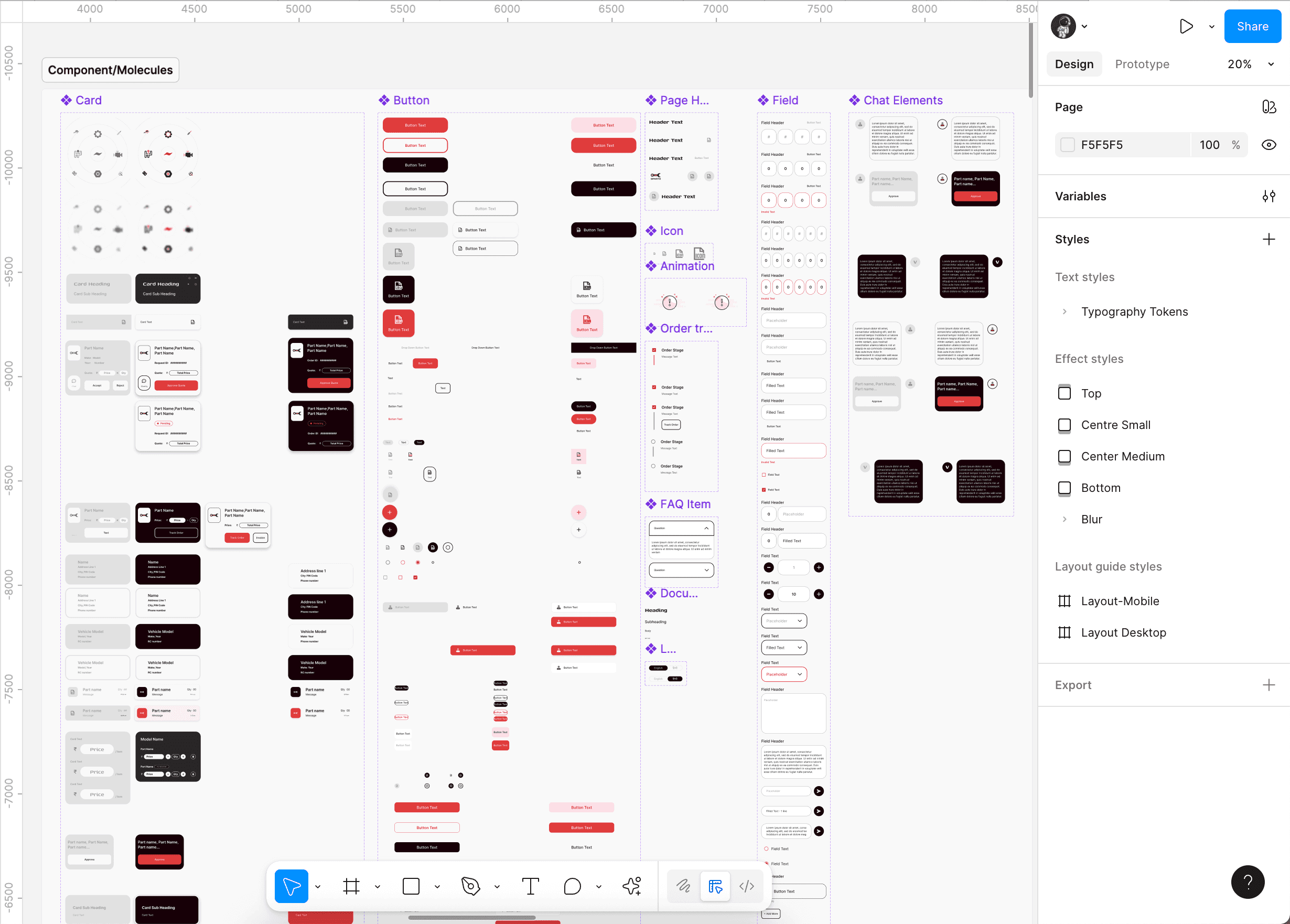
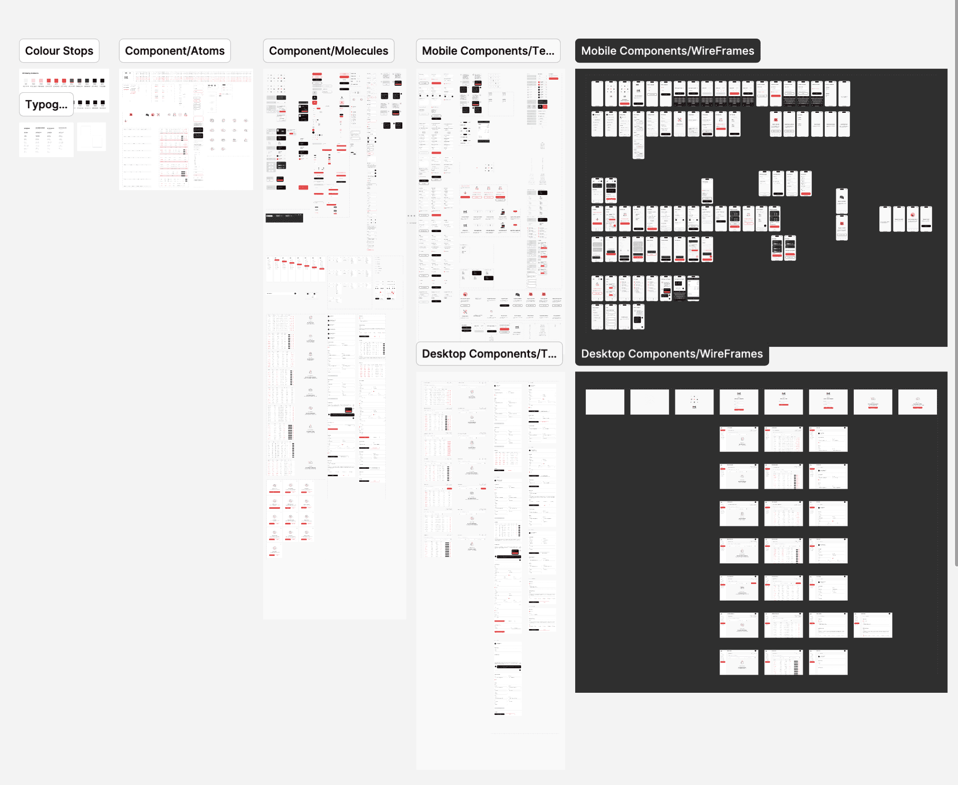
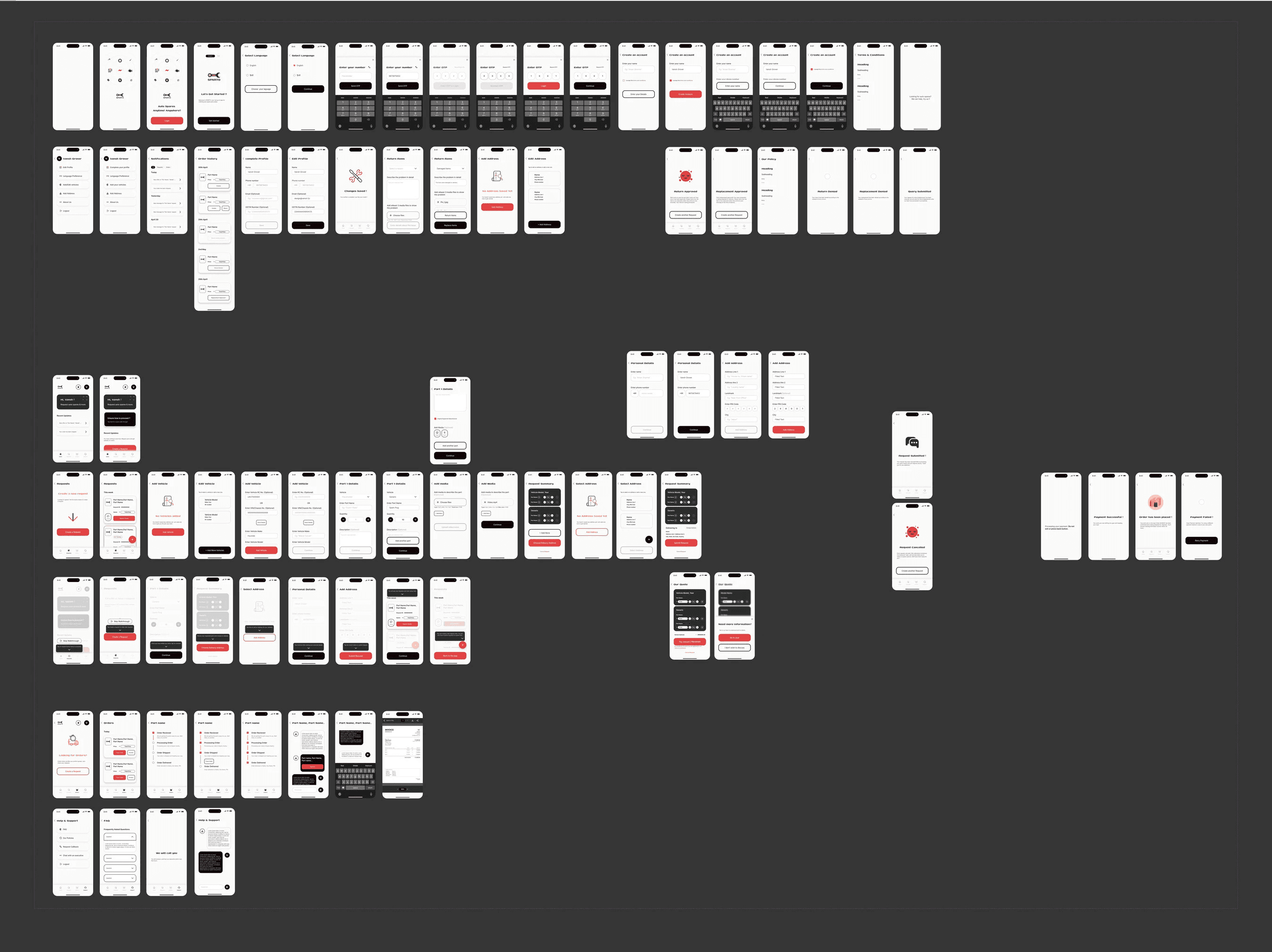
And finally I got to implement the design system to create the Mobile Wireframes.
Key Iterations
The design process involved extensive collaboration with the founders. We went through multiple rounds of wireframing and brainstorming to refine the request flow. This iterative cycle was crucial for balancing their deep industry knowledge with user-centered design principles.
Major feedback revolved around the form fields taking too much space for long forms and the task flow for return and replacement of items which was a key point of concern.
Before
After

I also leveraged the use of Rive and Lottie files for adding interactive animations to the app states. This gives the dev team appropriate files to work upon while implementing those for both flutter and react based apps hassle free.
Final Deliverables
The project concluded with two main deliverables:
A comprehensive Design System to ensure consistency across the platforms.
A high-fidelity, interactive prototype of the mobile app, detailing the complete user journey from request to delivery.
Takeaways & Reflection
This project was a fantastic exercise in designing for a non-traditional flow. My biggest takeaway was the importance of user research in a niche market, it helped me build a stronger case for key UI decisions with the client. It reinforced in me a fact that a designer's role often extends towards systems thinking where we need to be educators and act as a balance between the business and users needs together.